
An Overview
Bloom Pet is an independent e-commerce website project for selling pet products. It’s a freelance project I started with my friend in early 2025, and we’ve been developing it over several months.
Our small team included two designers (including me), one web developer, and one marketing partner. Together, we aimed to create a clean, friendly, and trustworthy shopping experience for pet owners.
As the lead designer, I was responsible for the UI/UX design, visual branding, and product curation. I worked closely with the developer to ensure the website looked and functioned smoothly, from wireframes to final implementation.
I also collaborated with our marketing partner to plan product categories and define our target audience.
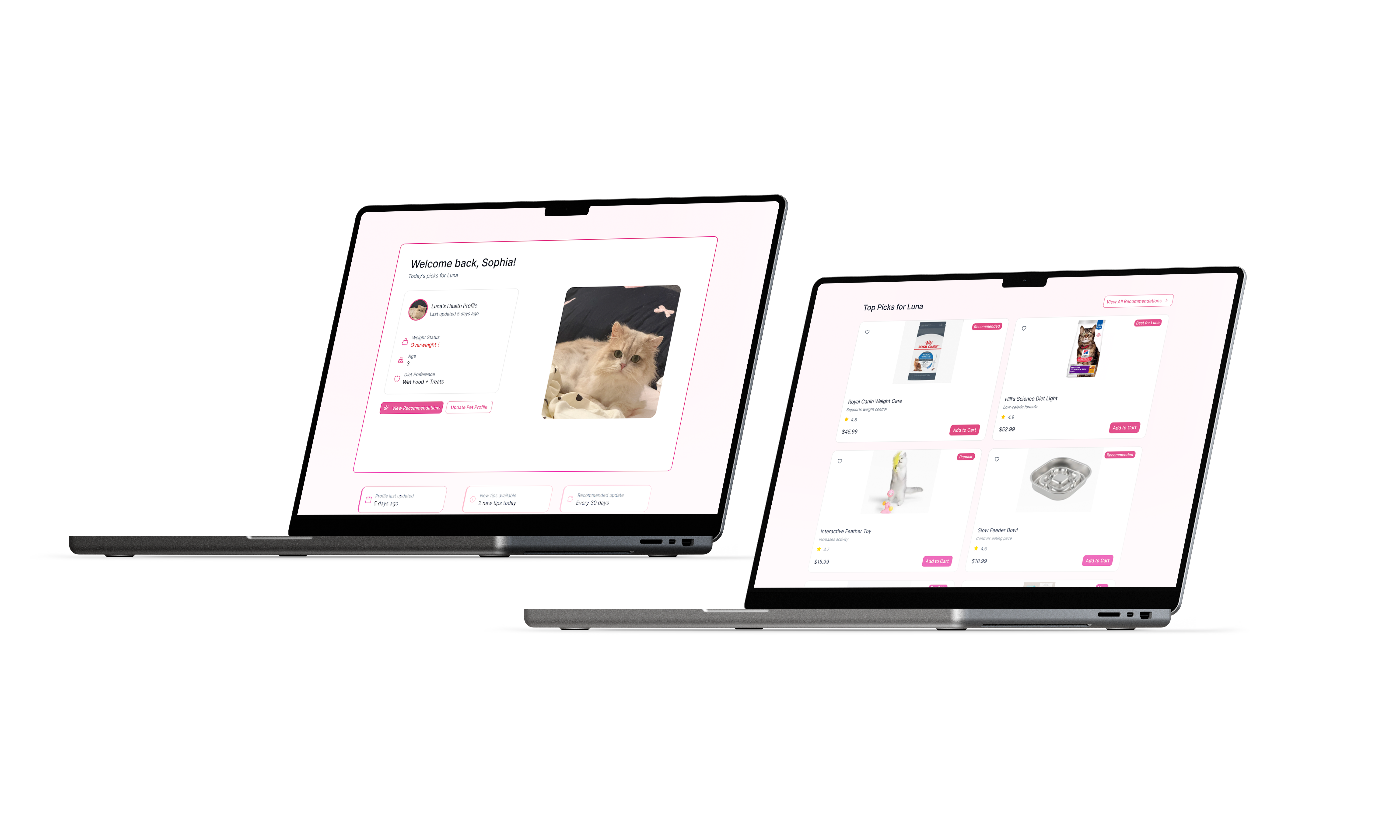
A key part of my contribution was designing a smart recommendation system that suggests products based on each pet’s health and lifestyle. For example, if a pet is overweight, the system recommends weight control food, and if a pet has dental issues, it suggests cleaning and care items. This feature makes the shopping experience feel more personalized and reassuring, helping pet owners find the right products with greater confidence.
The Challenge
Most pet e-commerce websites offer the same generic product listings for every user, with little to no personalization.
We wanted to change that by designing a system that understands each pet’s unique needs.
The main challenge was how to make the shopping experience feel intelligent and tailored, instead of overwhelming.
We needed a way to recommend products that respond to real pet conditions like weight, age, or dental health, without making the process complicated for users. This led us to develop a smart recommendation system that analyzes simple pet information and automatically suggests the most suitable products, making the experience more personal, supportive, and trustworthy.
Analysis
Through short surveys and interviews with 20 pet owners, I discovered that most users felt existing pet product websites didn’t provide useful or personalized suggestions.
Many said they wanted smarter recommendations that could actually understand their pet’s needs instead of generic product lists.
The main challenge was how to design a personalized shopping experience that feels intelligent and caring, without making the process too complex.
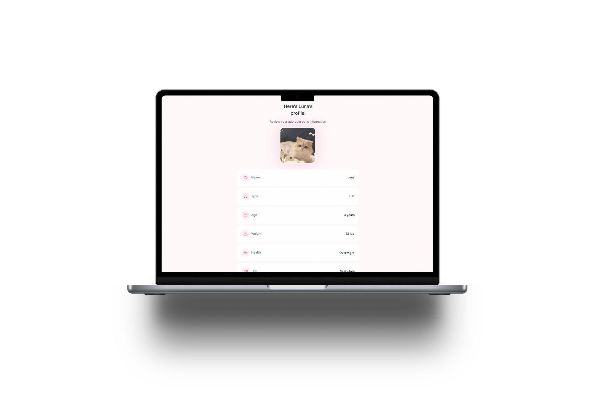
We aimed to build a smart recommendation system that connects each pet’s basic profile such as age, diet, and health condition to tailored product suggestions.
This personalization not only makes the shopping process easier and more efficient, but also builds emotional trust between the user and the brand.

Design Goal & Business Goal
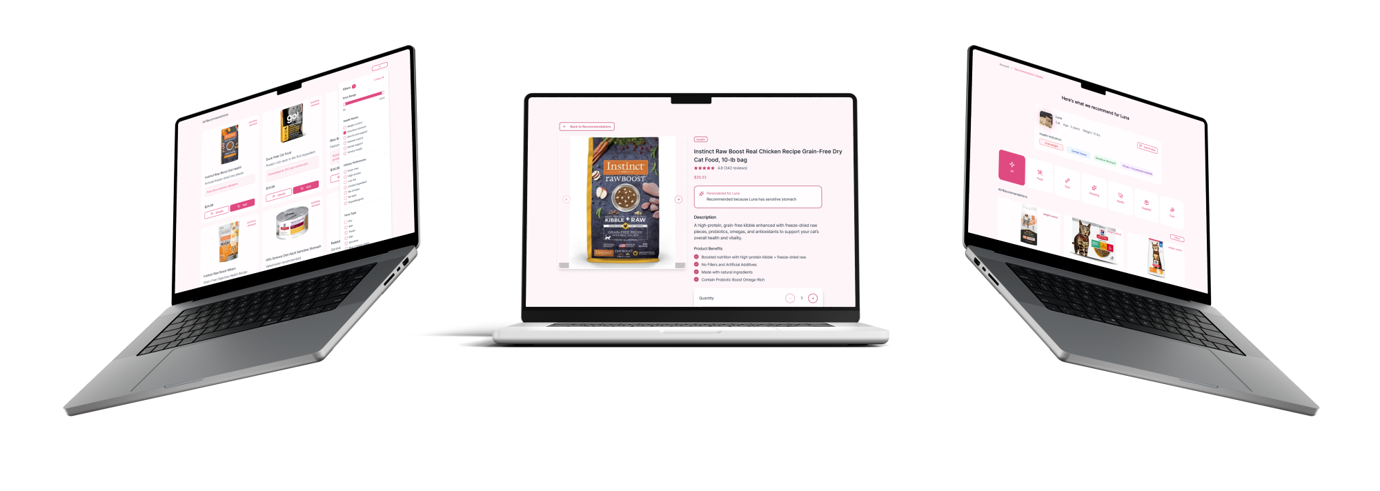
The goal of this project was to build an independent pet e-commerce website that truly understands both pets and their owners. The platform is designed around personalization, allowing users to create a simple pet profile with details such as age, weight, diet, and health conditions. Based on this information, the system automatically recommends suitable products and care tips, for example suggesting low-fat food for overweight pets or oral care products for pets with dental issues. This approach helps users quickly find products that match their pets’ real needs, making the shopping experience feel intelligent, caring, and easy to navigate. By offering guidance instead of overwhelming choices, the website builds trust and confidence while encouraging long term loyalty to the brand.
Research
Our main users are pet owners, both young and older generations, who live in cities and treat their pets as family members. They often shop online for food, toys, and health related products, but their motivations and behaviors differ slightly.
· Young generation (20s–30s)
They are busy professionals or students who value convenience, design, and personalization. They prefer websites that look modern, are easy to use, and can quickly suggest what their pets need. They are open to technology driven features, like smart recommendations and data-based product suggestions.
· Older generation (40s–60s)
They focus more on trust, safety, and clarity. They may spend more time reading product details and rely on personalized suggestions to guide their choices. A clear layout, reliable information, and friendly tone help them feel confident while shopping online.
Both groups appreciate a warm and trustworthy brand experience, but for younger users, personalization means efficiency and style, while for older users, it means guidance and reassurance.
User needs
From interviews and surveys, many users shared that it is difficult to find products that truly fit their pets’ individual conditions. They often scroll through hundreds of similar items without clear guidance, which makes the shopping experience feel tiring and uncertain. Users expressed a strong desire for a website that feels personal and caring, one that understands their pets’ health and provides smart, tailored suggestions rather than random ads or generic product lists. Some pet owners already track their pets’ diet, weight, or daily habits, and hope the website can use this information to recommend appropriate food, treats, or care products. Overall, users want personalized guidance instead of simple product lists, and trust grows when recommendations feel specific and relevant to their pets’ needs. A condition-based recommendation system was seen as especially helpful, such as suggesting weight-control food for overweight pets, teeth cleaning treats for pets with dental issues, soft snacks or joint supplements for older pets, and starter kits or care guides for puppies and kittens.
How it influenced my design
The research showed that users want a website that understands their pets, rather than simply selling products. Many felt lost on large e-commerce platforms and hoped for guidance that feels smart, caring, and supportive. Based on these insights, I focused on designing personalized and emotionally supportive experiences by developing a recommendation system that updates based on each pet’s profile, including age, health, and diet. I also added small interactive features such as “Health Tips” to create a stronger sense of care and community. The overall shopping flow was designed around guidance, helping users naturally find what fits their pets without endless searching. Through personalization, the website is positioned to feel more like a companion offering thoughtful suggestions and building trust, rather than functioning as a purely transactional platform.
Synthesize & Ideation
After analyzing user feedback, we realized that most pet owners wanted a website that understands their pets’ specific needs instead of presenting endless, generic products. Our goal became to design a personalized shopping experience that feels like a friendly guide, helping owners make better decisions for their pets’ health and lifestyle. We mapped a user flow centered on personalization, starting from the homepage with short questions about the pet’s age, breed, and health condition, followed by a smart product list that shows personalized recommendations based on those answers. On the product detail page, users can see tailored health tips and related suggestions, while the checkout and thank you pages provide care reminders and follow up recommendations. The website structure also reflects this idea, focusing on a small number of meaningful categories such as “Food & Health,” “Play & Comfort,” and “Care Tips,” rather than overwhelming users with too many options. Through reference research, we learned from Chewy’s friendly language and personal tone, as well as PrettyLitter’s approach of combining shopping with education, which inspired the integration of health tips alongside product recommendations. This stage helped shape our vision of a website that feels intelligent, caring, and personal a place that supports pet owners in caring for their pets, not just shopping for them.
How & Design
At the beginning of this project, my exploration was not focused on visual style, but on how users would feel and understand personalization. I focused on three main areas: how personalized recommendations should be presented, how much pet information users are willing to provide, and how health conditions can be translated into visual cues. I tested whether users preferred seeing a recommendation list immediately or first understanding why certain products were suggested, and explored different presentation methods such as tags, short hints, or a dedicated recommendation section. I also examined how to collect the minimum amount of pet information without overwhelming users, while still providing clear and useful recommendations. In addition, I explored how factors like weight, allergies, and age could be reflected through UI decisions, including color, layout priority, and short explanatory text. Alongside these explorations, I tested a friendly pink color palette to create a warm and welcoming feeling, with the goal of helping pet owners feel supported and cared for rather than stressed or judged when making decisions about their pets. In the early stage, I created wireframes to define the overall concept and web flow, and as the design became more complex, I moved toward high fidelity screens to better test clarity, emotional tone, and usability.
Impact
Feedback for this project was collected through interviews and short surveys with 20 pet owners, internal critiques with other designers, and quick usability tests with non design users. The feedback revealed several key issues: users found it difficult to choose products without clear filtering options, felt that personalized recommendations should live on a separate page instead of being mixed into the general product list, and thought the health tips section took up too much space and needed to be collapsible. Based on this feedback, I added clearer filter options to help users narrow results by pet needs and product type, which made browsing feel less overwhelming. I also created a dedicated recommendation page so users could focus on personalized suggestions without distractions from general products, and redesigned the health tips section to be collapsible, allowing users to control how much information they see while keeping helpful content easily accessible.
Reflection
This project helped me better understand what it means to design a personalized product experience. The personalized recommendation flow worked well because it was grounded in real user needs, and users felt more confident when they could see why a product was recommended instead of being shown products without context. The friendly visual style and warm color palette also contributed to making the experience feel caring rather than purely transactional. One challenge I encountered was balancing helpful information with visual clarity, as some screens became too dense when too much content was shown at once. If I were to revisit this project, I would test layout density earlier and iterate more quickly before moving into high-fidelity designs. Overall, the project taught me that personalization is not only about data or logic, but about translating information into clear, human-friendly UI decisions. Good personalization should guide users quietly, without making them feel confused or pressured. With more time, I would continue testing the recommendation flow with a larger group of users, explore more advanced personalization based on past behavior, and refine micro interactions to make the experience feel smoother and more responsive.
.png)